JD Williams VIP Design
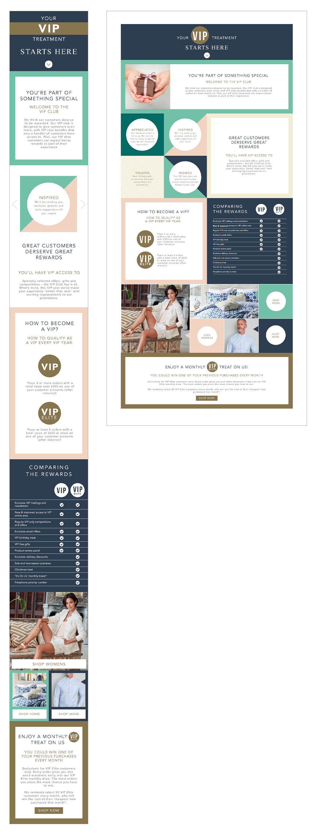
Designed and developed a responsive VIP signup page to drive enrollment in the new JDWilliams rewards program.
Challenge: Transforming a print leaflet into an engaging, content-heavy digital experience with limited imagery.
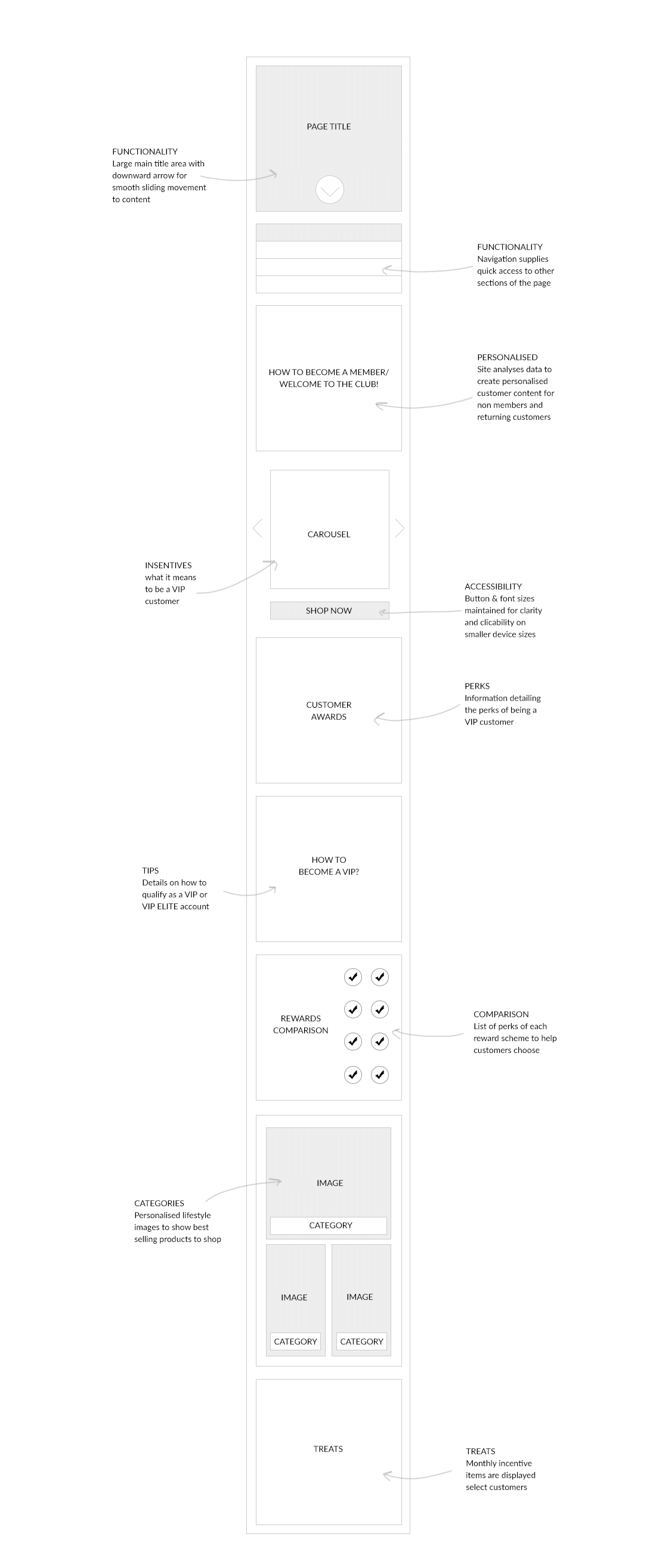
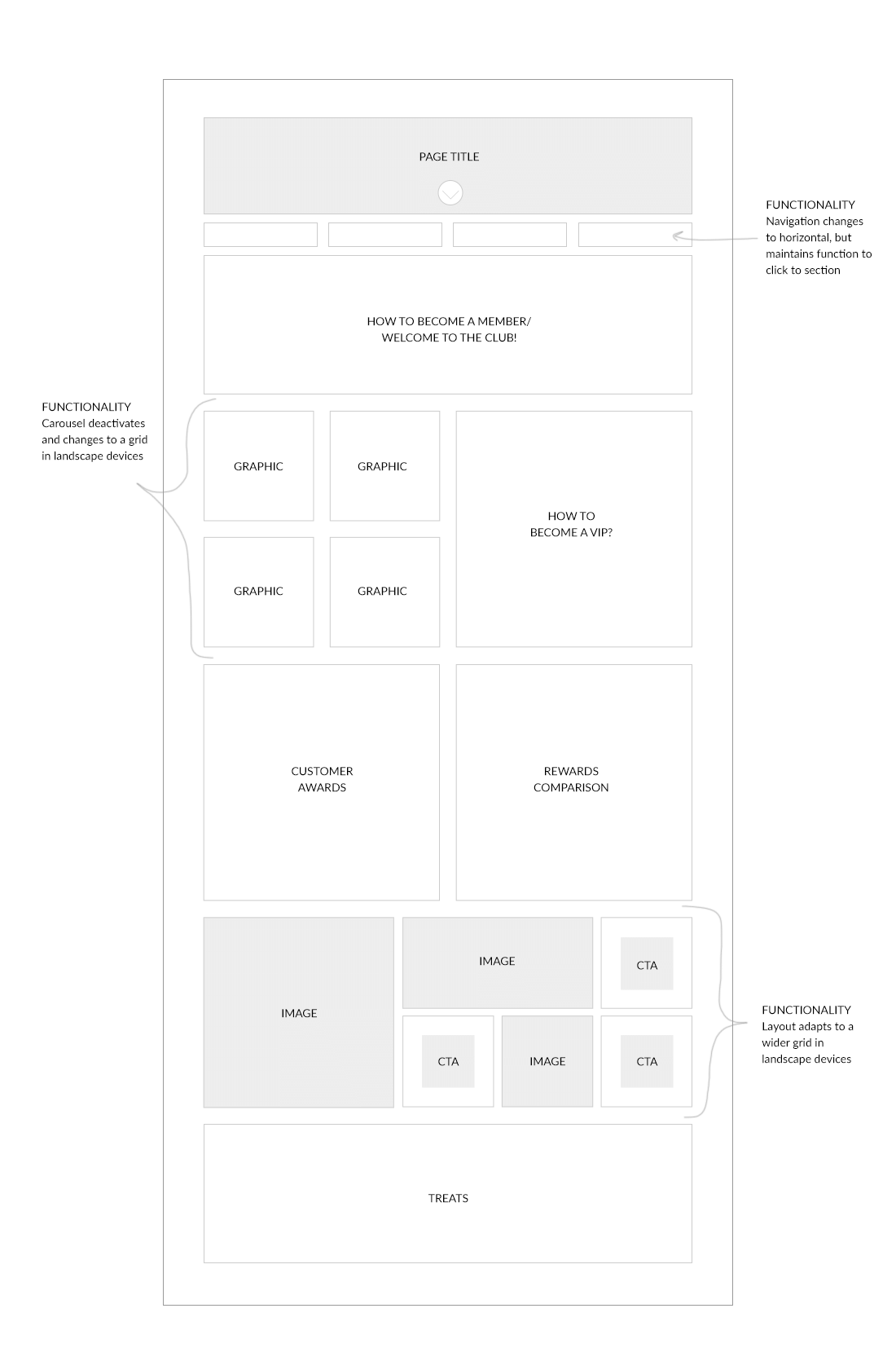
Solution: A bold, color-framed layout structured around key perks, maximizing clarity and conversion. Research and wireframing ensured functionality and future personalization via tools like Monetate.
Gift Finder Feature Implementation
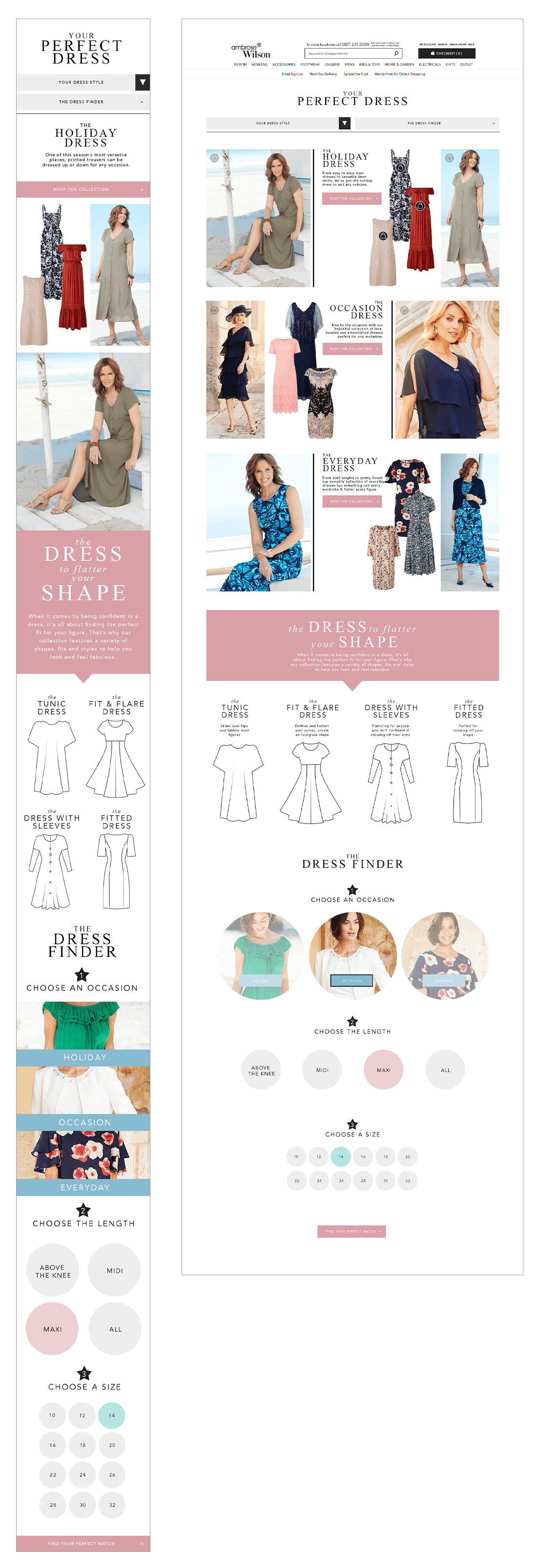
Designed and launched a new interactive Gift Finder feature to help customers discover the perfect dress based on their body shape.
Research on industry-leading functionality informed a four-step guided process. The final design utilized the brand’s pastel palette and custom-drawn dress illustrations to ensure a fresh, highly engaging, and directional customer experience.
Seasonal Brand & UI Style Guides
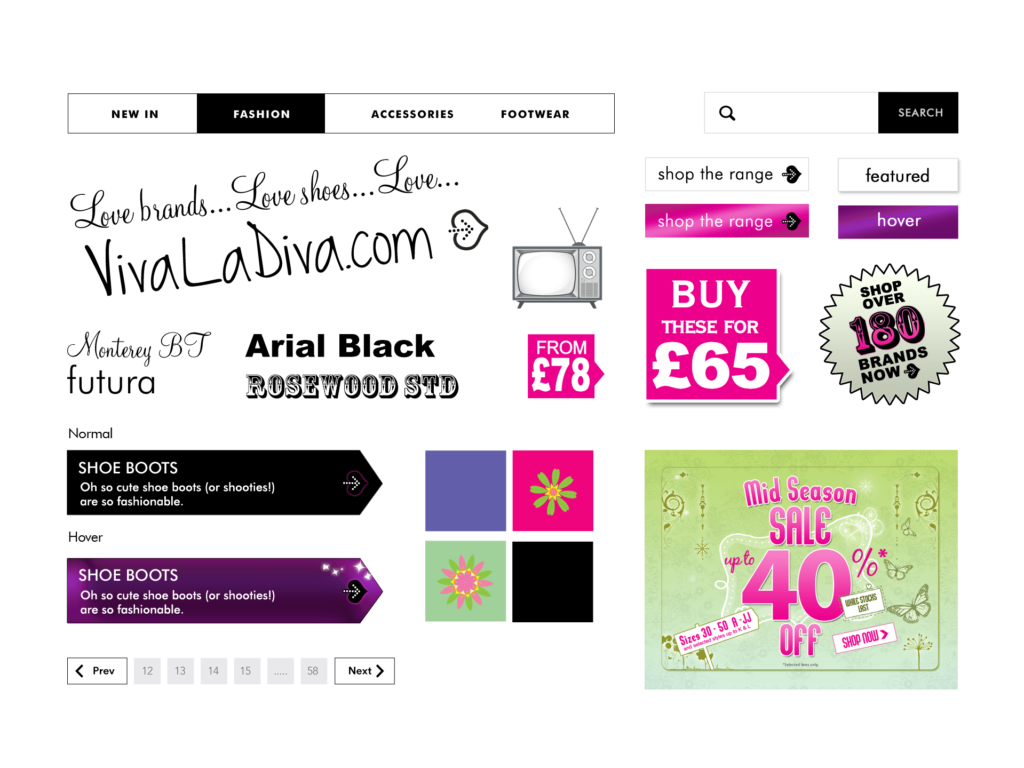
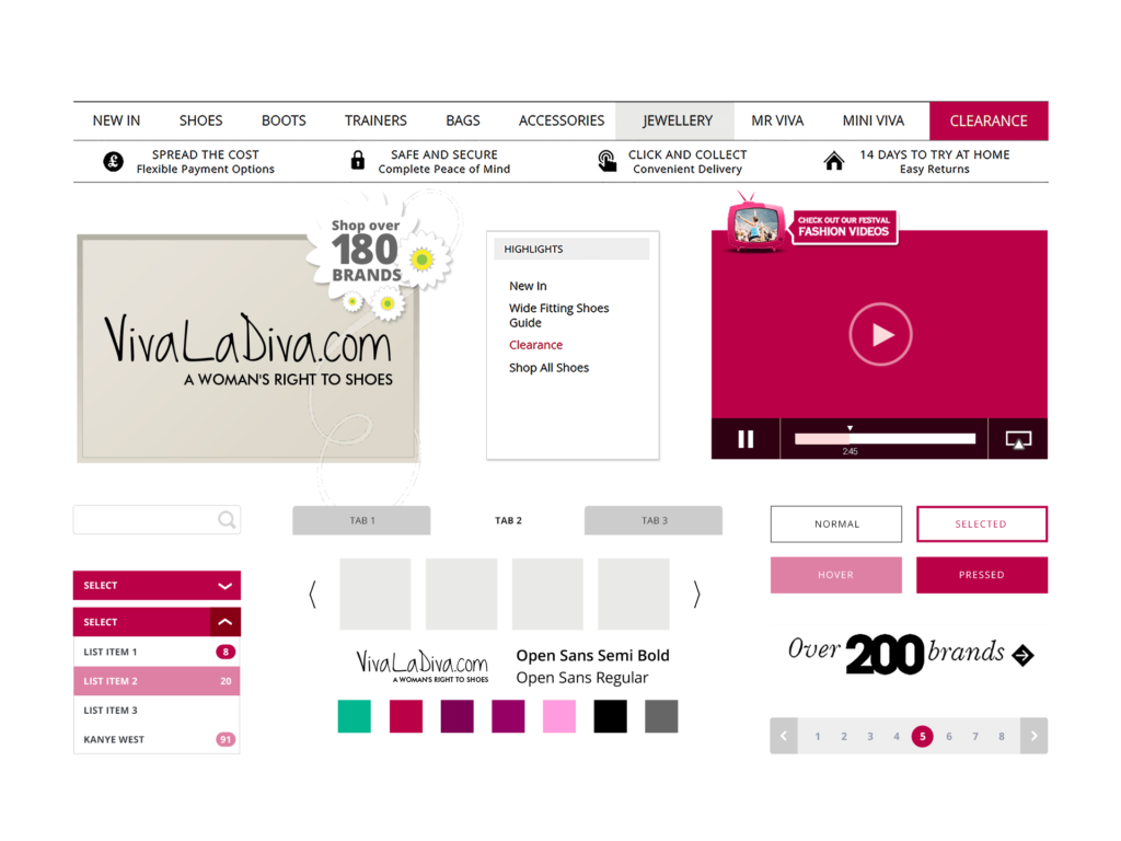
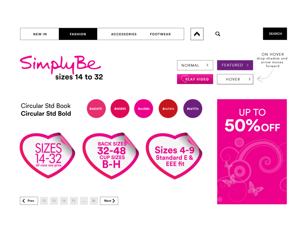
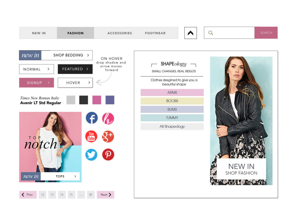
Following seasonal brand redesigns, I create comprehensive style guides and UI packs for the design team. These ensure brand consistency across all digital assets, covering specifications for fonts, colors, buttons, icons, and promotional display formats.
CLIENT – NBrown PLC
BRAND – JD Williams, Marisota, Simply Be, Vivaladiva
Responsive & Targeted Product Banners
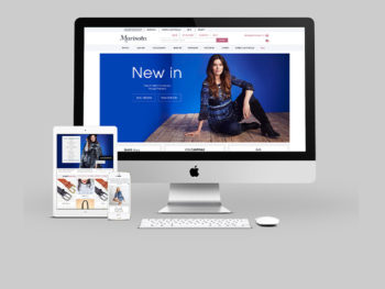
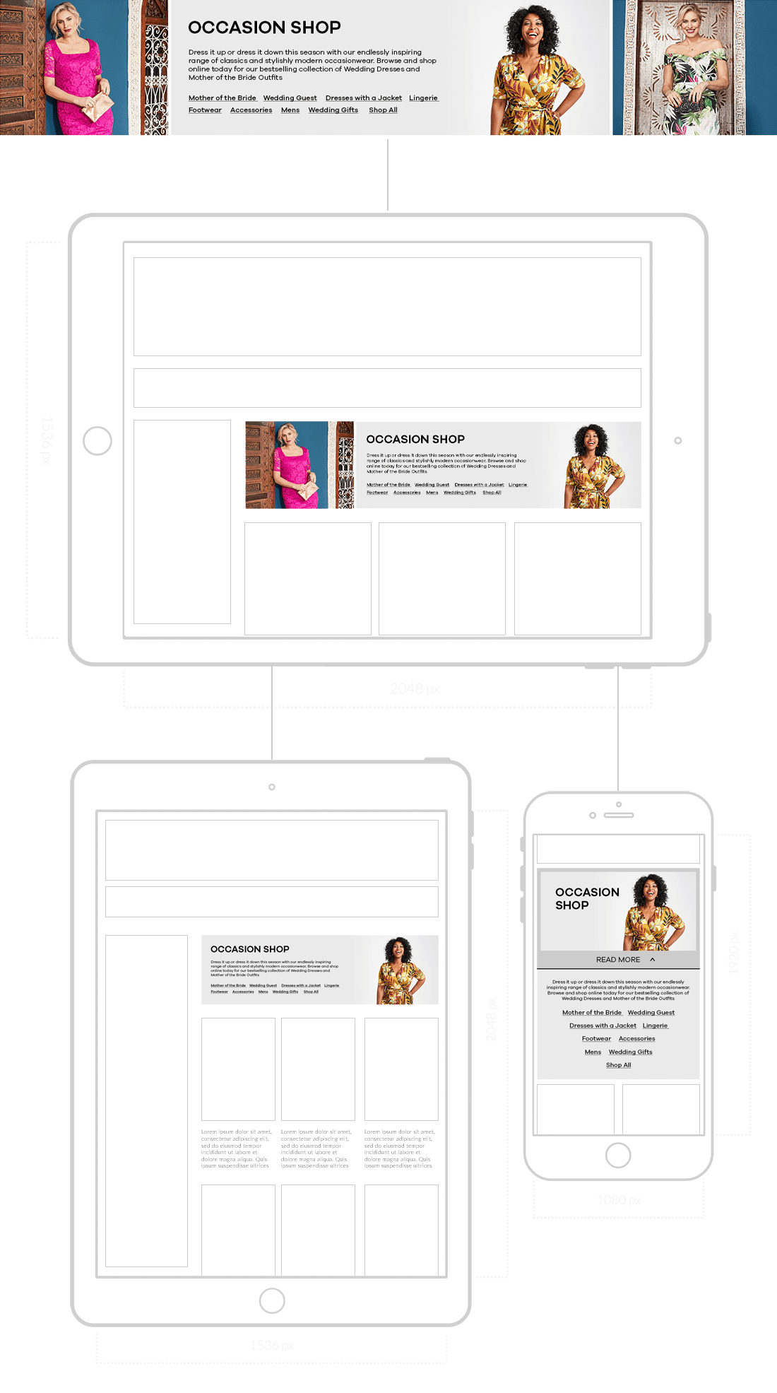
Designed and developed a system for product window banners prioritizing bold photography and fluid responsiveness across all device widths.
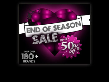
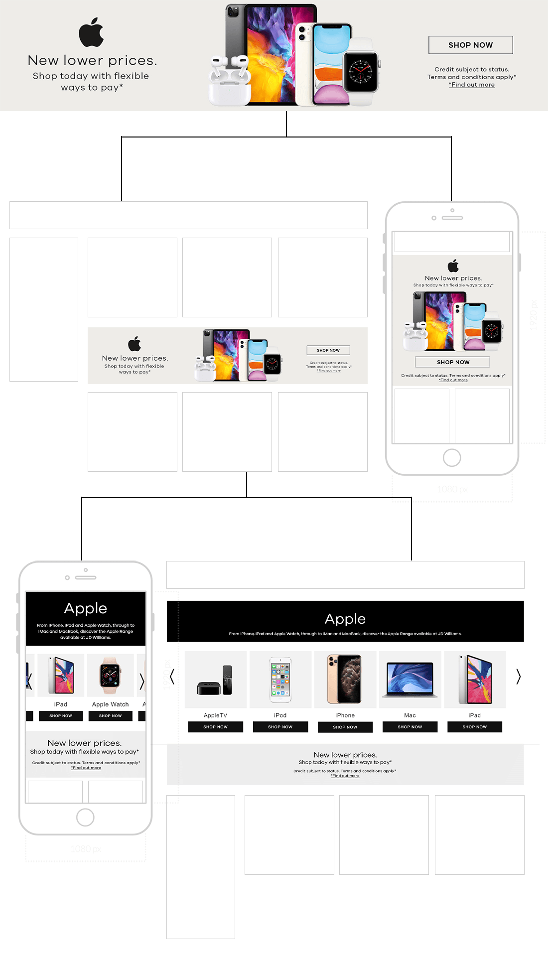
Simultaneously, created diverse Apple promotional banners tailored for specific customer journeys and A/B tested through multivariate analysis, ensuring high clarity and conversion across various site placements.
Community Theatre UX Redesign
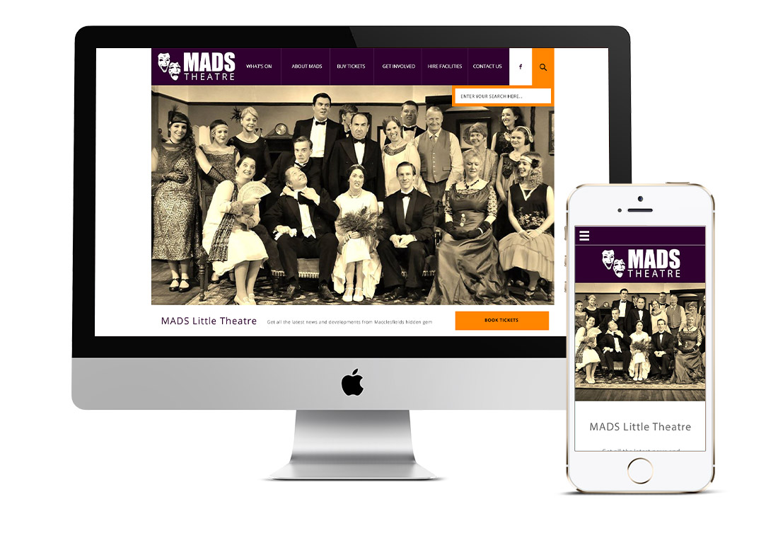
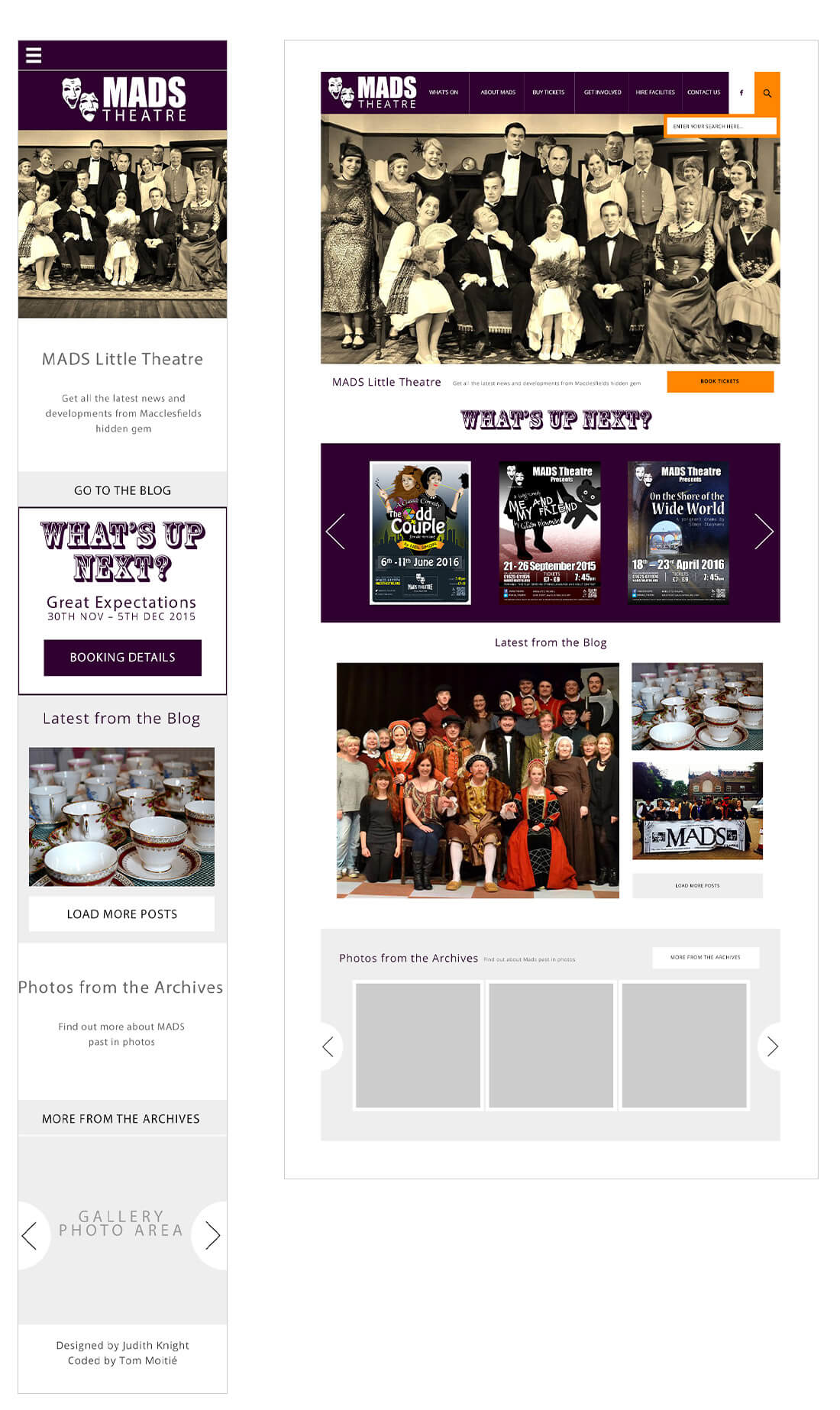
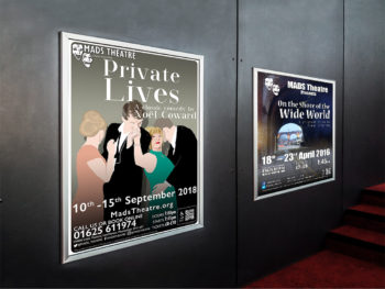
Executed a full, user-research-driven responsive redesign of the MADs Theatre website. Restructured content hierarchy to prioritize ticket sales, play promotion, and community engagement, drastically improving the mobile experience.
